top of page
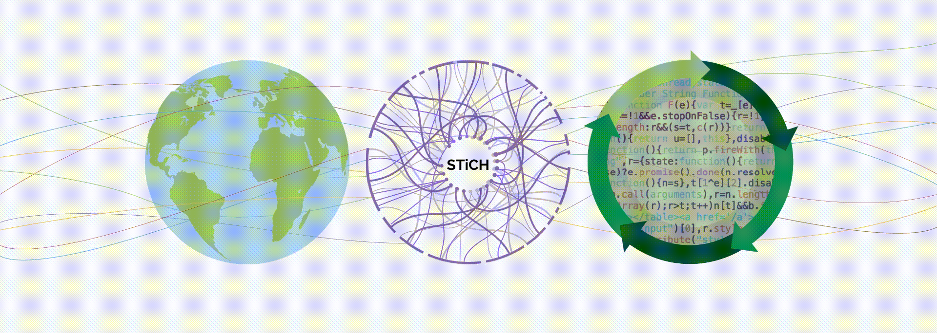
SUSTAINABILITY
TOOL
STiCH is a life cycle assessment tool to help cultural heritage professionals make educated, sustainable choices to lower the environmental impact of their work.
OVERVIEW
One of the greatest challenges of the 21st Century is climate change. Sustainability Tools in Cultural Heritage (STiCH) is a life cycle assessment (LCA) carbon calculator and library of case studies and information sheets developed to help cultural heritage professionals make educated, sustainable choices to lower the environmental impact of their work. In collaboration with FAIC and Pratt Institute, and working with a Tier II NEH grant, my role in this project transformed the brand identity (logo, typography, color palette) of the website as a platform to disseminate data as well as demystify complex information in a visually engaging tone.
Outcome
STiCH Website Design
15,000 views within 3 months of publishing
Published case studies
Visual identity
Timeline
June '21 - May '22
My Role
Website Design
Graphic Design
Data Visualization
Color Analysis
UI/UX consultant
In Collaboration with
School of Design, Pratt Institute
Sarah Nunberg, PI, Pratt Institute
Sarah Sanchez, PhD Candidate, NEU
Sarah Sutton, Principal Investigator

PROCESS
The design process began with team debrief by the principal investigators on their vision for the website and an introduction to the ongoing research work at Pratt and Northeastern University. We worked with Wordpress as the web hosting platform since the site would be affiliated and registered by FAIC's native workspace.
-
Typography - Working with the Twenty Twenty Wordpress theme and font plugins, I choose serif font 'Palantino' for title and H1 headings followed by 'Raleway' serif font family to give the website a classic editorial look.
-
Color palette - Colors for the website were carefully selected from the logo and paired with various adjacencies that would enable accessibility and contrast for visual impairments. It would also ensure that if any page was downloaded as a black and white pdf, the graphics would still observe the necessary contrast.
As we worked towards finalizing the landing page and its core message, we took the user into consideration; These included Conservators/ Designers/ Art Handlers/ Artists/ Architects/ Building Managers/ Engineers. With the variety of professionals viewing the website, it was essential that the visual tone represented their work but was not too specific to highlight one over the other. Instead we chose graphics and images for each page to reflect the contents of the consequent page.
DATA VISUALIZATION
Under the case studies and information sheets, the research team had compiled a comprehensive list of posts that were text heavy. I found that each study could be diagramed and illustrated for a more engaging viewing experience. We took the graphs, tables, flowcharts, and subject matter to transform it into a cohesive visual language followed throughout the website. This process ensured that there was visual consistency on each page and post published. Another important consideration was the knowledge transfer and design guides on Google Sheets for future application.
OUTCOME
The rise in the global temperature is a direct result of human activity, particularly burning fossil fuels and land use practices. The problem is so significant that every action matters, and each of us must take any action possible to reduce our negative impacts on the climate system. While others make changes in agriculture, energy, manufacturing and policy, STiCH uses information and tools such as LCA people to make better, more informed decisions for reducing individual and institutional impacts through their robust website.
With the chosen visual language, we brainstormed major themes of the organization and developed a wireframe that would highlight and celebrate those key messages. The synthesis of these core ideas would also form the basis of upcoming on-site exhibitions.
-
Call to Action - STiCH is designed for cultural heritage professionals who want to do their part, who want to make better decisions about the materials, processes and systems they use to do their work.

Typography: Selected font families for the Wordpress site

Core messages: Key themes that apply to the overall sitemap and layout

Landing page in a desktop version

Color palette: 7 selected colors to be applied to site assets
Finalized design for main pager hero images
OVERVIEW
One of the greatest challenges of the 21st Century is climate change. Sustainability Tools in Cultural Heritage (STiCH) is a life cycle assessment (LCA) carbon calculator and library of case studies and information sheets developed to help cultural heritage professionals make educated, sustainable choices to lower the environmental impact of their work. In collaboration with FAIC and Pratt Institute, and working with a Tier II NEH grant, my role in this project transformed the brand identity (logo, typography, color palette) of the website as a platform to disseminate data as well as demystify complex information in a visually engaging tone.
Outcome
STiCH Website Design
15,000 views within 3 months of publishing
Published case studies
Visual identity
Timeline
June '21 - May '22
My Role
Website Design
Graphic Design
Data Visualization
Color Analysis
UI/UX consultant
In Collaboration with
School of Design, Pratt Institute
Sarah Nunberg, PI, Pratt Institute
Sarah Sanchez, PhD Candidate, NEU
Sarah Sutton, Principal Investigator
ANORA
AMBIENT NOSES
A cross-modal toolkit comprising a family of smart lighting fixtures for the home that sense dangerous gasses for those who don’t have the ability to smell.

Line drawing of a generic crate
Exploded view 3D animation using Maya
Systems design flowchart and infographics

Responsive layout for professionals on the fly

Sitemap: Finalized version of the pages layout and architecture

Illustrations and icons for case studies

Wireframe building upon the Twenty twenty Wordpress theme

Landing page design with call to action

Final post design for publishing case studies

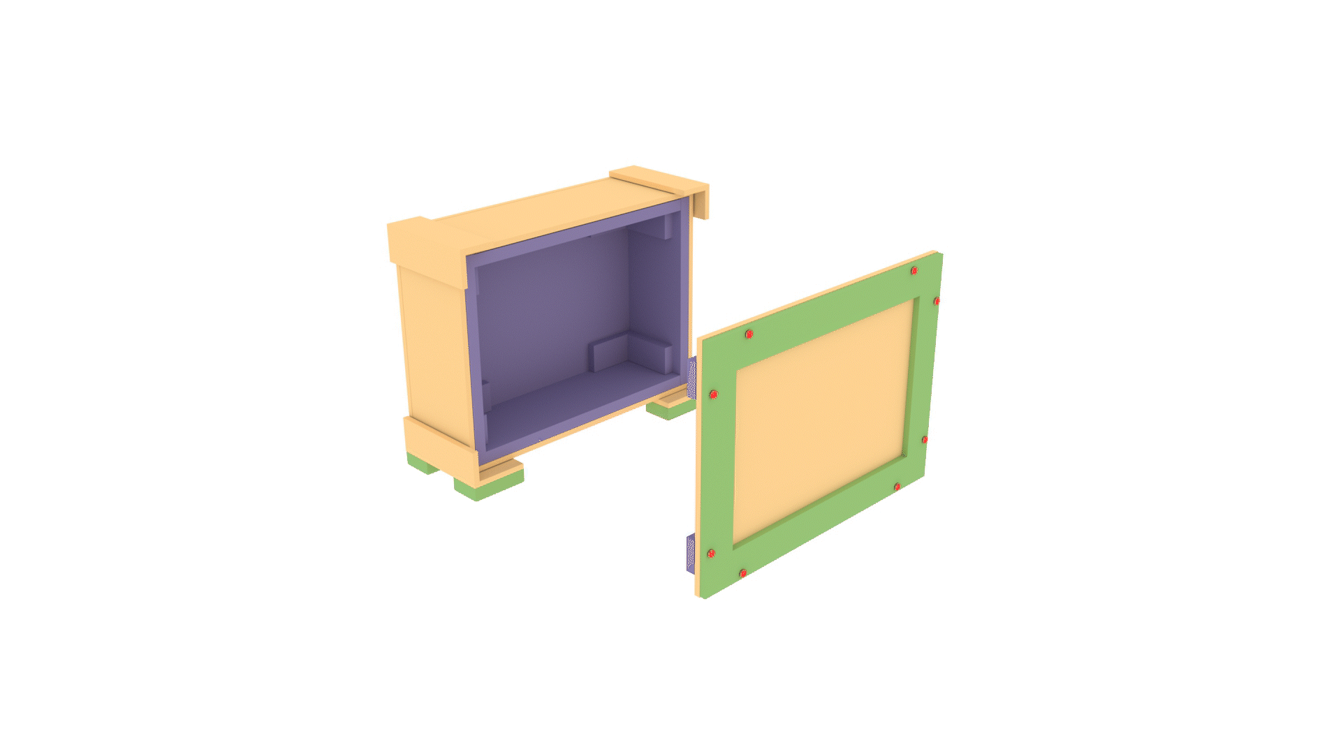
Conversion of data into a designed table for the Crates case study
-
Crates case study - A representation of a crate from the case study is presented in a both fully constructed and deconstructed form. The fully constructed crate provides the viewer with the opportunity to consider the environmental impacts of each component of a crate.
Each Case Study focuses on a specific anecdote but all scenarios reach beyond the study parameters, across cultural heritage preservation, storage, and exhibition specialties. The case studies are written and designed so the reader can apply aspects of each to their individual situation.

Working guides for future use without the presence of a designer
bottom of page